Mr. Met Doesn’t Belong On A Cap
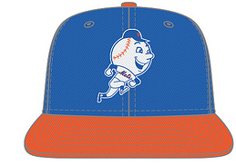
The Mets have redesigned their batting practice cap to feature Mr. Met on the front. I can sum up my feelings about this in three letters: WTF?!?!

I like Mr. Met as much as the next guy but putting him on the front of the cap is the wrong move. I know it sounds old school but the front of the cap is where the team logo belongs. If the mascot is going to be anywhere on the uniform it should be as a sleeve patch (which the Mets did with Mr. Met a few years ago). Thought I don’t like the idea of batting practice caps since they are strictly for marketing (“buy all 6 of the caps the team will be wearing this season”) I can understand the cap being less formal than a game cap. So if you must put Mr. Met on it put him on the side or the back where he compliments your main brand which is the team logo.
If you enjoyed this post, please consider to leave a comment or subscribe to the feed and get future articles delivered to your feed reader.


what does it matter where itis